Contour plot
The Dewesoft Contour plot shows three-dimensional arrays (Matrix data), or a group of three scalar channels where two channels specify the axis (xy) positions and the third specifies the values for those positions.

The widget is intended for illustration of data values mapped across two axis dimensions. Values within a certain interval will belong to the same contour, having the same color. The contour borders can be indicated with isolines. The closer the isolines are together the larger the changes in values are in that area of the plot.
Contour plots are used in different domains, but for many it is mostly known for plotting weather data, such as contours of geographical elevation and depth, barometric pressure, rainfall amounts, and wind speeds over a geographic area.
But, contour plotting can also be pretty valuable as an alternative to the 3D graph for other scenarios where you as a user want to overview trends in data across ranges of different physical quantities - to see how the different measured parameters are correlating with each other.
One example of this is when performing Motor analysis where among other things the motor efficiency is investigated. Here, motor efficiency contours are plotted across a range of speeds and torque loads in an efficiency heat map, as shown below:
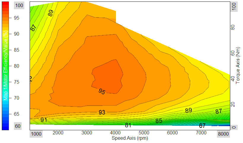
In the plot above the motor efficiency is mapped out - making it possible to overview the optimal speed and torque range for the motor to operate within.
In general the 2D/3D mapping math module can be used to tag/map two scalar channels to a third channel. The mapped channels will then work as axis positions for the third channel. Such output data can be visualized in the Contour plot widget.
Properties
The Contour plot widget properties are divided into two groups. First, common general widget properties, and second, specific Contour plot widget properties.
Show isolines and isoline values
Enabling isolines will draw black border lines (isolines) between the different contours. In some cases the isolines can help with highlighting the different contours.
Enabling isoline values will add values at the contour borders, on top of the isolines. The numbers indicate the specific values found between the different contours.
Isoline step
The Isoline step defines the resolution of contours. If the isoline step is increased the number of contours are reduced and vice versa.
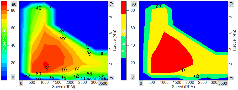
Below you see an example with two contour plots, where the left plot has an isoline step of 5 [%] and the right plot has a step size of 25 [%].
Show measured points
Enabling Show measured points will draw dots at all locations where data is available.
If this data source is a Matrix the measured points will be positioned in a rectangular grid. If the data source is three grouped scalar channels (XYZ channels) then the measured points can be spread randomly over the plotted area.
Ignore invalid values
By enabling Ignore invalid values, data points with a certain user-defined value will be ignored.
For example you might want data points having a value of 0 to be ignored since zero might indicate invalid data. This is done by typing 0 at the Invalid value field.
Swap X and Y axis
Enabling this will switch the plot graph view from (X, Y) to (Y, X).